Project Overview
Now, first off, this is entirely of my own doing. Completely self-initiated.
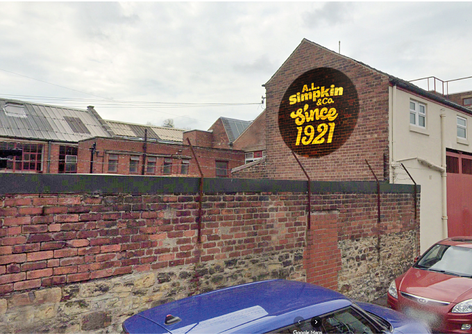
Our lad (as they’d say), who lives in Hillsborough, stumbled on the A L Simpkins factory while walking his children to school - and knowing my predisposition toward all things singular, he mentioned it.
They (the Simpkins) have been turning out sweets on the site for over a hundred years and are still going strong. They claim the invention of the ’travel tin’, which is also fabulous. I dropped by the place on a Sunday on late October and to buy some tins from the corner shop just up from them - some of the pictures here are from that visit.
The others I’ve ‘borrowed’ from the Simpkins pages (so, apologies to whoever took the pictures. I can’t find a credit but will happy append one.)
To the idea then.
My contribution to this
With nothing against the current packaging nor having anything much more than a creative itch to scratch, my only excuse for a strategy was ‘what if this were given a bit of a shake-up?’
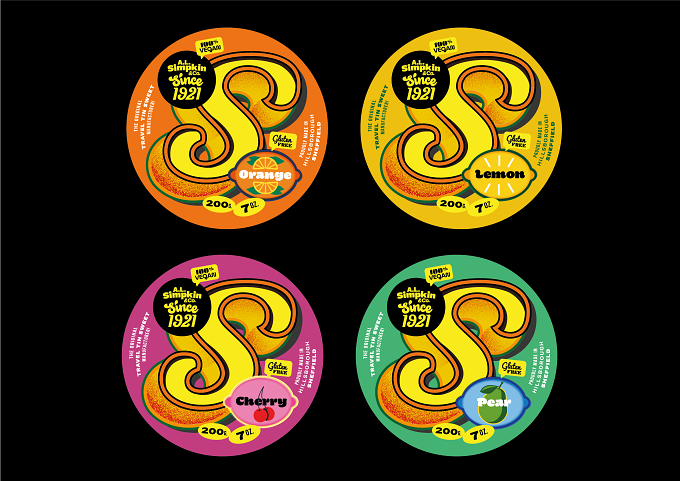
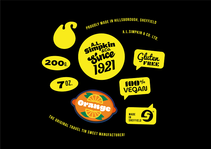
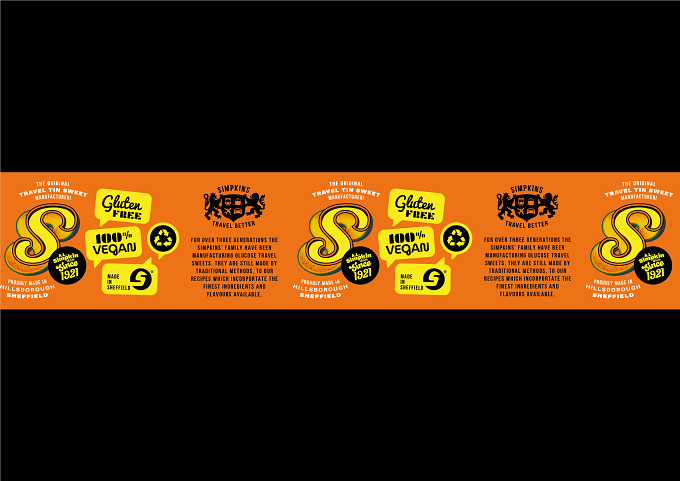
The intention and direction was to make the lids really pop.
In store they tend to recede into busy backgrounds, as well as having a slightly ‘chemist-shop’ aesthetic (again, nothing amiss with that.
Simpkins began life making sweets for chemist shops to stock.)
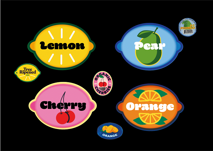
I’m trying to give the brand a bit more elbow-room in the eye with a mixture that’s partly travelling fairground (they’re sweets made to travel, after all) hand-painted lettering (and a nod to the original shop sign when they were also a grocer) and given the good ingredients, referencing fruit stickers for added zestiness.
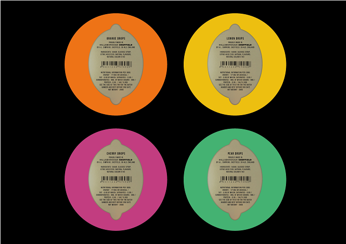
The stickers vernacular is also extended to the information design, bringing the vibrance of local stores into the mix as well.
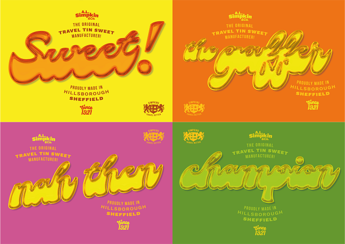
The overall impression is something like a sign-writer might knock out for a shop-keeper looking to add a bit of vim to the window display. Sort of. Not too serious, lots of fun, sweet but not twee, definitely uplifting.
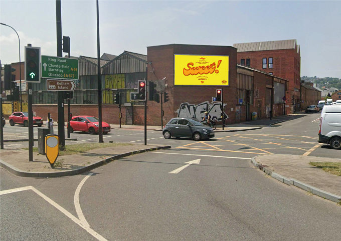
From there I’ve also scratched away at something campaign-like, with the big-yummy-type rendered as a boiled sweet. The wording is deliberately Sheffield slang and the intention is for eye-appeal profile-raising. The visuals are based on poster sites near the Sheffield Wednesday stadium (just down the road from the factory) as well as the ever on-trend Kelham Island.